Homeschool Art Lesson: Shading Using 5 Values
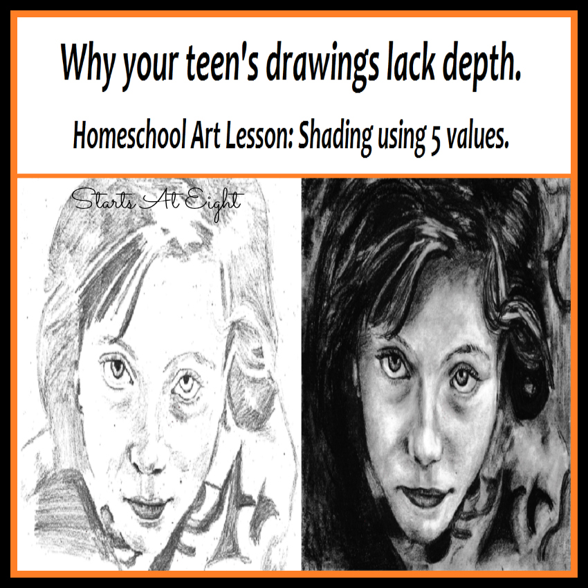
Why do your teen’s drawings lack depth?
Has your teen artist ever said in a self-deprecating way, “I’m not very good at shading.” Now I know, as a parent, you will want to soothe their little ego and reassure them that their drawings are amazing. Which they are, compared to last year’s drawings.
Certainly remind them of their progress, pull out some old drawings and show them how far they’ve come. Stroke their ego, they’ll enjoy it. Then… look at their drawings the way they do, compared to what they could be, will be, next year. And help them get there.
That is my goal today, to inspire your artist to be incredible at shading! I have a printable lesson and resource pack for your artist.
Print it here {Why your teen’s drawings look flat. Homeschool Art Lesson: Shading Using 5 Values } or follow along to read the lesson!
Homeschool Art Lesson: Shading Using 5 Values
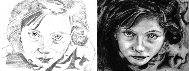
What is lacking in the first drawing? You could say it looks flat, or it lacks depth. Look at the drawings for a minute, what is the biggest difference in the shading?
You may point out that the superior drawing looks darker. Or you may say, it has more contrast. Real life is darker, it has shadows, or in art talk value.
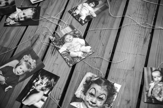
Think of a black and white photo. If you were color blind this is how you would see the world. A range of shadows or values graduated from the darkest black to the lightest gray and only areas of pure light would appear as white highlights.
In the first drawing, the darkest black is missing and so are the darker grays. Instead, all we have is a drawing using the lighter range of grays to represent life.
Let’s fire 3 missiles to strike out this problem.
Missile 1: Better materials.
Use a range of pencil softness. Time to discover 8B.
Are you still using an HB pencil to draw? Gasp! How sad. I suggest that you leave that light gray pencil for sketching. What you need is the B pencils, the soft ones. These will give you the darkest blacks you are missing.
Get a 2B, 4B, 6B and an 8B. You can make do with less if you have the 8B for the darkest blacks and perhaps a 4B for mid-tones, then the rest can be done using variations in pressure.
Tip: For the darkest blacks with little effort use charcoal.
Missile 2: Better tools.
Use a value scale and value finders to accurately identify and duplicate a full range of value in your drawings.
Values can be tricky. You look at a shadow and you think you know how dark it is, but you’re wrong! There is an optical trick at work that you might not be noticing. Shadows will appear darker next to lighter areas and lighter next to darker areas.
We have 2 tools to help us overcome this problem and accurately identify the value of the shadows we are trying to represent. Value scales and value finders.
Think of them as the greyscale version of a paint card. When you want to paint a room you get a series of paint cards from the hardware store then when you lay them against your bedroom wall you can find the exact color match.
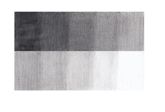
Value scale: A set of greyscale “paint cards” stepping evenly from darkest to lightest. Make your own or use my printed version. The more steps you have the more precisely you can match the value. I prefer to simplify things and use a 5 step value scale.
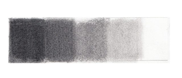
Value finder: A value scale, but full of holes. For even more exact comparison of values. This completely counteracts the optical trick, allowing you to match up the exact value. It’s better to have more steps with a value finder, ten is a good number.
Missile 3: Graduation.
Use a blending tool to create gradual transitions from one tone to another.
In real life, anything that has depth has shadows on and around it. Those shadows are graduated. That means that they always move smoothly from dark to light or light to dark. As an object curves or angles away from the light source, the shadows gradually become darker.
To create these graduations in my drawings I like to find the five basic values (Black, dark gray, medium gray, light gray and highlight) and then use a blending tool. I start at the darker tone then decrease the pressure as I move into the lighter tone. I use the value finder mainly for checking and fixing.
Tips:
- There are no clean jumps from light to dark or from medium tone to black except where the edge drops off. Save those clean edges for actual edges of an object in front of another object.
On that note, no thick black lines. This is hard, especially for me, but realistic drawings don’t have coloring book outlines. Shade to the edge of the object, then shade the background up to that edge.
- When drawing your line drawing use light faint lines… if you have a heavy touch like me, try some of those H pencils and draw with the side of the lead instead of the tip.
- How you rub the pencil onto the paper is so secondary to properly identifying the values that I’m not even going there today. Sufficient to say: to go darker use a softer pencil, more pressure, and more layers, and vice versa for lighter tones.
Putting it all together! Art challenge: The Perfect Snack
Using a reference photo, shade a traced line drawing of your favorite snack!
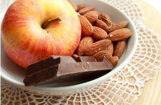
Time to test what you’ve learned. Gather your supplies. B-Pencils, check! Value scale and Value finders, check. Find or create a reference photo of your favorite snack. Easiest with a B&W reference photo, but same concept with a color photo.
To ensure our line drawing is perfect we’ll make a faint line drawing by tracing our reference photo using a backlight. I like to use a table lamp for this. Place your photo on the bottom and your paper on top. Hold them together over the top of the lamp and trace the main outlines.
Use the value scale and value finder to precisely match the values in your photo and your drawing. Be amazed at how well you can shade when you treat it like painting your room and put the exact shade right where it goes!


